You’re building a brand. You open a blank canvas and stare at it. You know you need colors — but which ones? What goes with what? What looks professional and not like something thrown together in five minutes?
Most people either copy a competitor’s palette or spend hours going through color wheels and hex codes. Neither actually works well.
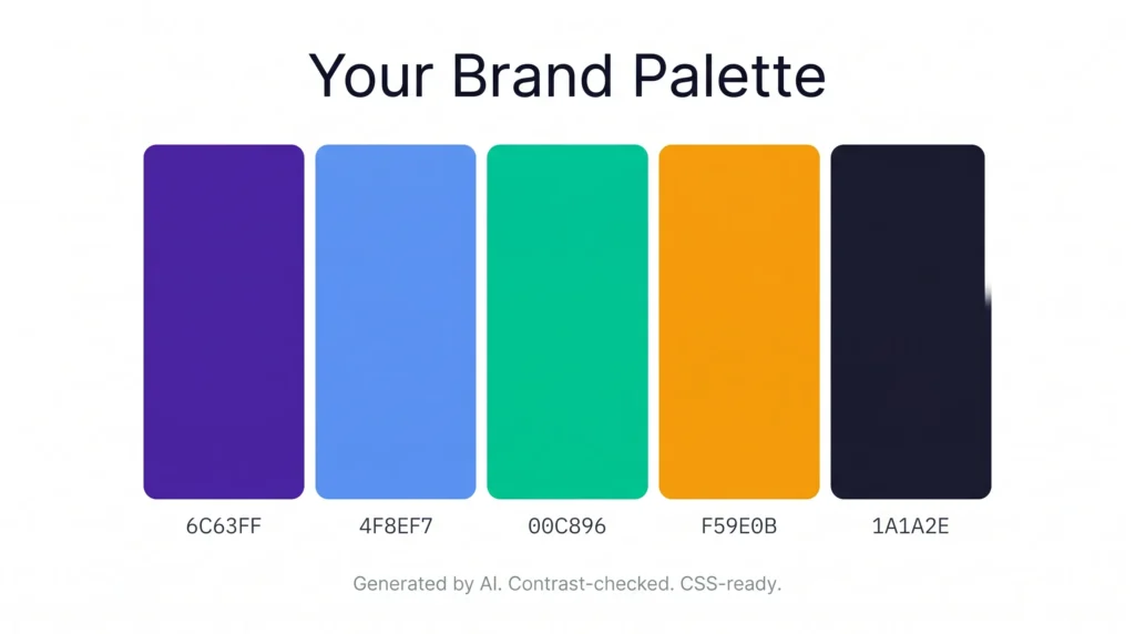
BrandHue by AIToolsE generates a complete brand color palette from a single input — instantly, free, with contrast checking built in and CSS export ready. No design experience needed.
Why Most People Pick the Wrong Brand Colors
Color choice is not just about what looks nice. The colors you pick for a brand do three specific jobs:
- Recognition — People recognize brands by color before they read the name. Think of any major brand and you already know its color.
- Emotion — Colors trigger specific feelings. Blue communicates trust. Red creates urgency. Green signals growth or health. Getting this wrong sends the wrong message about your brand.
- Accessibility — Text on a background needs enough contrast to be readable by everyone, including people with visual impairments. Many professionally designed websites fail this basic check.
Picking colors randomly — or just using “colors you like” — means you’re likely failing at least two of these three jobs.
What the BrandHue Color Palette Generator Does
| Feature | Details |
|---|---|
| Palette generation | AI-generated from a single color or keyword input |
| WCAG contrast check | Yes — checks accessibility compliance automatically |
| UI preview | See your palette on real interface mockups |
| CSS export | Yes — copy CSS variables directly |
| Signup required | No |
| Cost | Free |
| Works on mobile | Yes |
The WCAG contrast check is what separates this from most color tools. It tells you whether your text is actually readable against each background color — before you build anything with it.
How to Generate Your Brand Color Palette
Step 1 — Open the tool
Go to brandcolor.aitoolse.com. No account, no signup screen.
Step 2 — Enter your input
Type a color name, a hex code, or a keyword that describes your brand. Examples: “forest green,” “#6C63FF,” “professional finance brand,” “playful children’s app.” The AI builds a palette from whatever direction you give it.
Step 3 — Review the generated palette
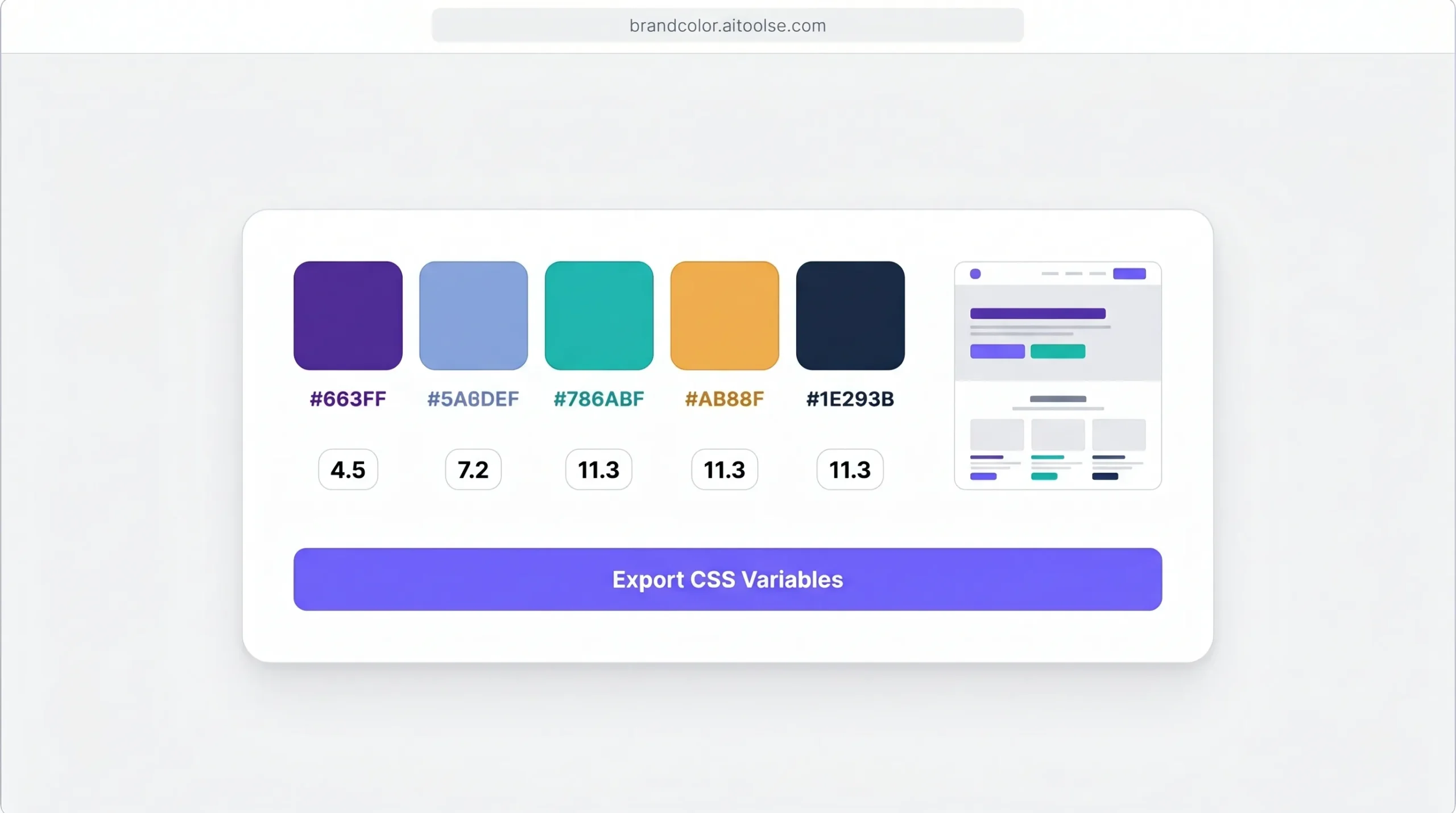
The tool outputs a full palette — primary color, secondary colors, accent, neutral, and background tones. Each combination is shown with contrast scores.
Step 4 — Preview on real UI
See how your palette looks applied to an actual interface — buttons, cards, text, navigation. This is where most color tools stop, but seeing it on a real layout is what tells you if it actually works.
Step 5 — Export your palette
Copy the CSS variables directly into your project. No manual conversion, no hex-to-CSS lookup. Paste and go.
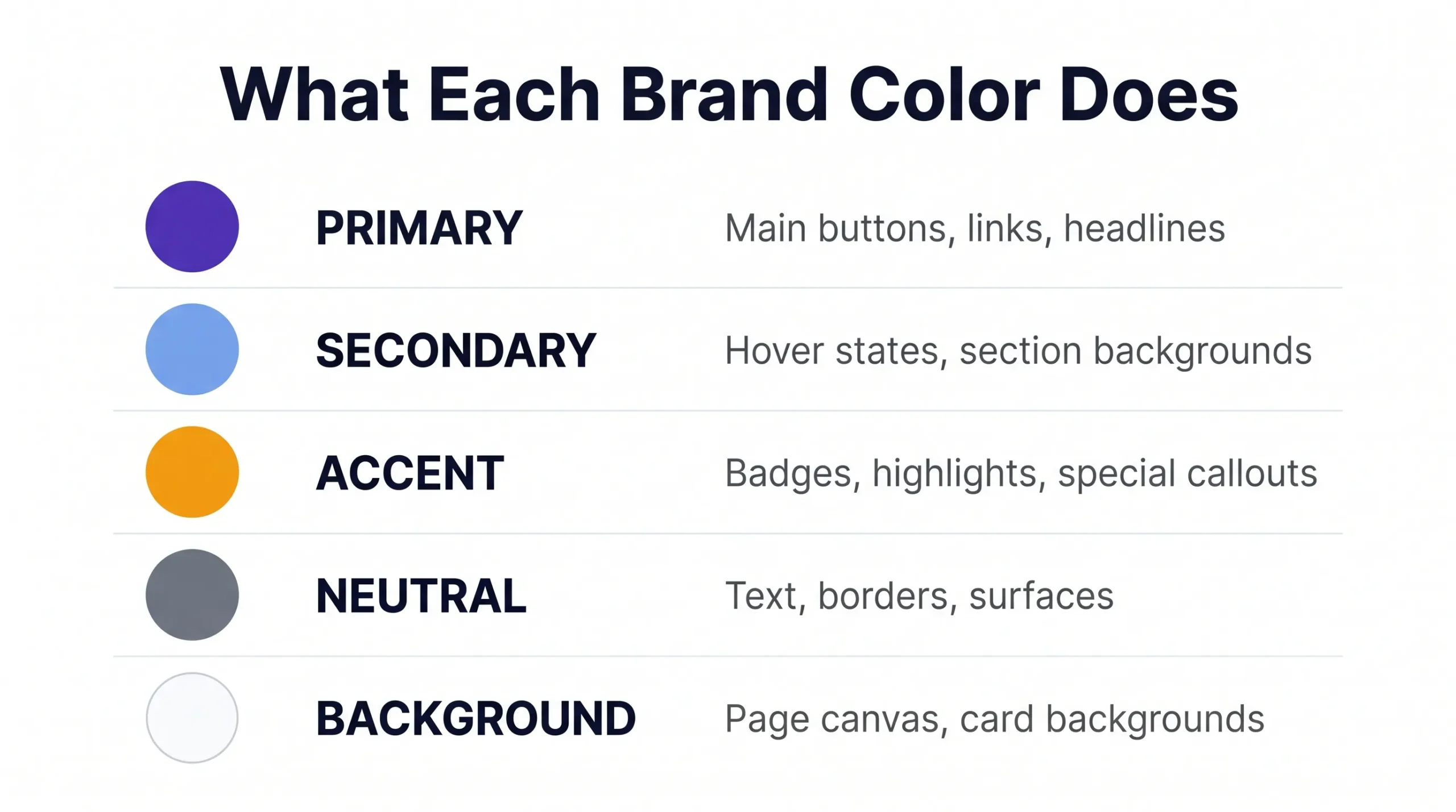
What Each Color in a Brand Palette Actually Does
A proper brand palette is not just a set of colors you like together. Each color has a role.
Primary color
Your main brand color. This goes on buttons, links, key headings, and anywhere you want attention. Most of your branded touchpoints use this color.
Secondary color
Supports the primary. Used for hover states, section backgrounds, or secondary buttons. Should complement the primary without competing with it.
Accent color
Used sparingly for highlights, badges, tags, or special callouts. Often a contrasting hue that makes important elements pop.
Neutral colors
Grays, off-whites, and near-blacks. These handle most of your text, borders, and background surfaces. Good neutrals are what make a palette feel professional rather than chaotic.
Background color
The canvas everything sits on. Pure white (#FFFFFF) is not always the best choice — a very slight warm or cool tint can make a design feel much more refined.
Color Psychology — What Your Brand Colors Say
Color is not just aesthetic. It communicates before a single word is read. Here’s what common color directions actually signal:
- Blue — Trust, reliability, professionalism. Used by banks, tech companies, healthcare. Safe choice for any brand that needs to build confidence quickly.
- Green — Growth, health, nature, money. Works for sustainability brands, finance apps, health and wellness, and anything connected to progress.
- Purple — Creativity, premium quality, innovation. Common in tech, beauty, and luxury adjacent brands.
- Orange — Energy, enthusiasm, affordability. Good for consumer apps, food brands, and anything targeting younger audiences.
- Red — Urgency, passion, appetite. Works for promotions, food brands, and brands that want to trigger action fast.
- Black/Dark — Sophistication, luxury, authority. Works for premium and high-end brands across almost every category.
- Yellow — Optimism, warmth, attention-grabbing. High visibility but easy to overuse. Usually works best as an accent.
Picking your primary color based on what you want people to feel about your brand is a better starting point than picking what looks nice.
What WCAG Contrast Actually Means and Why You Should Care
WCAG stands for Web Content Accessibility Guidelines. The contrast requirement says that text needs a minimum contrast ratio of 4.5:1 against its background to be readable by people with visual impairments.
In practice, this means a lot of “beautiful” color combinations fail. Light gray text on white. Yellow text on white. Pastel text on light backgrounds. They look fine to some people and are completely unreadable to others.
Beyond accessibility, contrast directly affects conversion. If your call-to-action button text is hard to read, fewer people click it. If your body text strains eyes, people leave faster.
BrandHue checks this automatically for every color combination it generates. You see the contrast score before you commit to anything.
Frequently Asked Questions
Is BrandHue completely free?
Yes. No account, no trial, no hidden upgrade. Generate as many palettes as you need for free.
Can I use the generated colors for commercial projects?
Yes. Colors themselves are not copyrightable. Any palette you generate is yours to use in any commercial project.
What is WCAG contrast and why does it matter?
WCAG stands for Web Content Accessibility Guidelines. A minimum contrast ratio of 4.5:1 between text and background is required for readability by people with visual impairments. Failing this makes your site harder to use and can affect legal compliance in some regions.
Can I export the colors to CSS?
Yes. The tool exports your palette as CSS variables that you can paste directly into your stylesheet. No manual conversion needed.
How many colors does a generated palette include?
A typical generated palette includes a primary color, secondary color, accent color, neutral tones, and a background color — everything you need to build a consistent brand visual system.
Do I need a design background to use this tool?
No. The tool is built for non-designers. You input a direction — a color, a keyword, or a brand description — and the AI handles the rest.
Does it work on mobile?
Yes. Browser-based and fully responsive. Works on any device without an app.
Conclusion
Your brand colors are often the first thing people see before they read your name. Getting them right — not just pretty, but purposeful and accessible — is one of those things that quietly affects everything from click rates to how professional your brand feels.
You don’t need a designer or a paid tool to get it right. You need the right direction and a generator that checks the work for you.
Generate your brand palette free → brandcolor.aitoolse.com